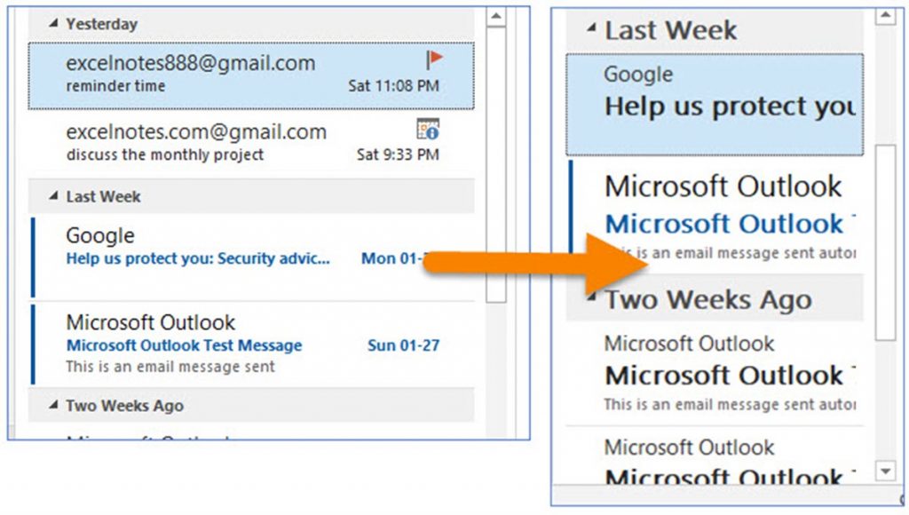
Why Choosing the Right Font and Size Matters
When it comes to crafting effective Outlook emails, the importance of selecting a clear and readable font and size cannot be overstated. The font and size of your email can significantly impact recipient engagement and response rates, making it a crucial aspect of email communication. In fact, research has shown that emails with a clear and readable font and size are more likely to be opened, read, and responded to, resulting in higher conversion rates and a stronger return on investment.
The best font and size for Outlook emails can vary depending on the purpose and audience of the email. However, there are some general guidelines that can help ensure your email is readable and effective. For example, using a font size between 10-14 points can help strike a balance between readability and brevity, making it easier for recipients to quickly scan and understand the content of your email.
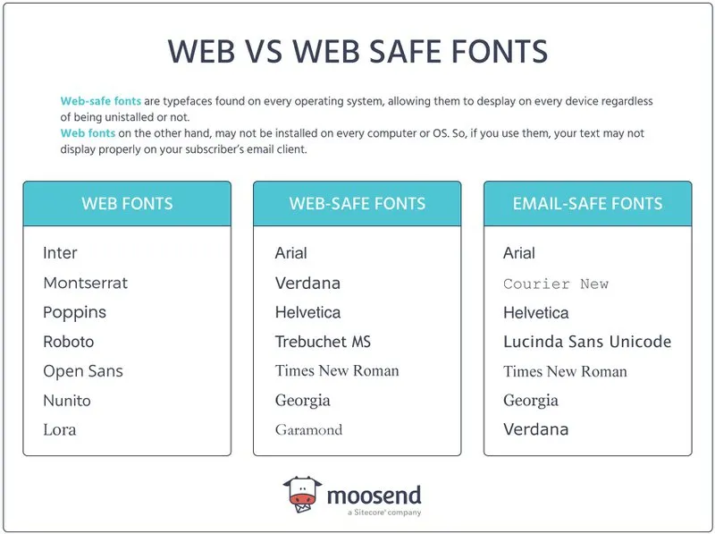
In addition to font size, the type of font used can also play a significant role in the effectiveness of your email. Fonts like Arial, Calibri, and Helvetica are popular choices for Outlook emails because they are easy to read, professional, and compatible with most devices. Avoid using fonts that are too ornate or difficult to read, as they can detract from the overall message and impact of your email.
By selecting a clear and readable font and size, you can help ensure your Outlook emails are effective and engaging, resulting in higher response rates and a stronger return on investment. In the next section, we’ll explore how to select the best font for your Outlook emails, including tips and recommendations for popular fonts and font sizes.
How to Select the Best Font for Your Outlook Emails
When it comes to selecting a font for your Outlook emails, there are several factors to consider. The font you choose should be easy to read, professional, and compatible with most devices. Some popular fonts that meet these criteria include Arial, Calibri, and Helvetica. These fonts are widely used in business communications and are known for their clarity and readability.
Arial is a classic font that is easy to read and works well in a variety of contexts. It is a sans-serif font, which means it does not have any decorative flourishes or serifs. This makes it a good choice for emails that need to be read quickly and easily. Calibri is another popular font that is known for its modern and professional look. It is a clear and readable font that works well in a variety of settings.
Helvetica is a versatile font that is widely used in business communications. It is a sans-serif font that is known for its clean and modern look. It is a good choice for emails that need to be read quickly and easily, and it works well in a variety of contexts. When selecting a font for your Outlook emails, it is also important to consider the font size. A font size that is too small can be difficult to read, while a font size that is too large can be overwhelming.
Ultimately, the best font for your Outlook emails will depend on your personal preferences and the specific needs of your email. However, by choosing a font that is easy to read, professional, and compatible with most devices, you can help ensure that your emails are effective and engaging. In the next section, we’ll explore the ideal font size for Outlook emails, including recommendations for font sizes between 10-14 points.
The Ideal Font Size for Outlook Emails: A Balance Between Readability and Brevity
When it comes to selecting the ideal font size for Outlook emails, there is a delicate balance between readability and brevity. A font size that is too small can be difficult to read, while a font size that is too large can be overwhelming and make the email appear cluttered. The best font and size for Outlook emails should be large enough to be readable, yet small enough to keep the email concise.
Research has shown that font sizes between 10-14 points are ideal for Outlook emails. This range allows for clear readability while also keeping the email concise and easy to scan. Font sizes below 10 points can be difficult to read, especially for recipients who may have visual impairments. On the other hand, font sizes above 14 points can make the email appear cluttered and overwhelming.
It’s also important to consider the line spacing and paragraph structure when selecting a font size. A font size of 12 points with a line spacing of 1.5 can make the email appear more readable and easier to scan. Additionally, breaking up large blocks of text into smaller paragraphs can help to improve the overall readability of the email.
Ultimately, the ideal font size for Outlook emails will depend on the specific needs of the email and the preferences of the recipient. However, by selecting a font size that is large enough to be readable, yet small enough to keep the email concise, you can help ensure that your emails are effective and engaging. In the next section, we’ll explore best practices for using font styles and formatting in Outlook emails, including tips on using bold, italics, and underlining to draw attention to important information.
Best Practices for Using Font Styles and Formatting in Outlook Emails
When it comes to using font styles and formatting in Outlook emails, there are several best practices to keep in mind. The goal is to draw attention to important information and enhance the overall readability of the email, without overwhelming the recipient. Here are some tips for using font styles and formatting effectively:
Use bold font to draw attention to important information, such as headings, key points, and calls to action. However, use bold font sparingly, as too much of it can make the email appear cluttered and overwhelming.
Use italics to add emphasis to certain words or phrases, or to set off quotes or citations. However, use italics sparingly, as they can be difficult to read in large blocks of text.
Use underlining to draw attention to important information, such as links or key points. However, use underlining sparingly, as it can make the email appear cluttered and overwhelming.
Use font colors to add visual interest to the email, but use them sparingly and consistently. Avoid using too many different font colors, as it can make the email appear cluttered and overwhelming.
Use font sizes to create a clear hierarchy of information, with headings and key points in larger font sizes and body text in smaller font sizes. However, use font sizes consistently throughout the email, and avoid using too many different font sizes.
By following these best practices for using font styles and formatting in Outlook emails, you can create emails that are clear, concise, and effective. Remember to use font styles and formatting sparingly and consistently, and to test your emails before sending them to ensure that they appear as intended.
How to Ensure Your Font and Size Choices are Accessible to All Recipients
When selecting a font and size for your Outlook emails, it’s essential to consider accessibility. This means ensuring that your email is readable and understandable by all recipients, including those with visual impairments or disabilities. Here are some tips to help you ensure your font and size choices are accessible to all recipients:
Use clear and simple language: Avoid using jargon or technical terms that may be unfamiliar to some recipients. Use clear and concise language that is easy to understand.
Avoid clutter: Keep your email layout clean and uncluttered. Avoid using too many images, graphics, or fonts, as this can make the email difficult to read.
Use alt text for images: If you include images in your email, make sure to use alt text to describe the image. This will help recipients who are unable to view the image to understand its content.
Choose a font that is easy to read: Select a font that is clear and easy to read, such as Arial, Calibri, or Helvetica. Avoid using fonts that are too ornate or difficult to read.
Use a font size that is large enough to be readable: Use a font size that is large enough to be readable, but not so large that it becomes overwhelming. A font size between 10-14 points is usually a good starting point.
Test your email: Before sending your email, test it to ensure that it is readable and accessible to all recipients. Use email preview tools to check how your email will appear on different devices and browsers.
By following these tips, you can ensure that your font and size choices are accessible to all recipients, and that your email is effective and engaging. In the next section, we’ll explore popular font and size combinations for Outlook emails, including recommendations for specific industries or purposes.
Popular Font and Size Combinations for Outlook Emails
When it comes to selecting the best font and size for Outlook emails, there are several popular combinations that can help you achieve your goals. Here are some examples of popular font and size combinations used in Outlook emails, including recommendations for specific industries or purposes:
For formal business emails, a combination of Arial or Calibri in size 12 points is a popular choice. This font and size combination is professional, easy to read, and compatible with most devices.
For marketing campaigns, a combination of Helvetica or Open Sans in size 14 points is a popular choice. This font and size combination is modern, attention-grabbing, and easy to read on a variety of devices.
For emails that require a more creative or artistic approach, a combination of Georgia or Times New Roman in size 10 points is a popular choice. This font and size combination is elegant, sophisticated, and easy to read.
For emails that require a more technical or scientific approach, a combination of Courier or Monaco in size 12 points is a popular choice. This font and size combination is clear, concise, and easy to read.
Ultimately, the best font and size combination for your Outlook emails will depend on your specific needs and goals. By considering the purpose and audience of your email, you can select a font and size combination that is effective and engaging. In the next section, we’ll explore tips for testing and refining your font and size choices, including using email preview tools and gathering feedback from recipients.
Tips for Testing and Refining Your Font and Size Choices
Once you’ve selected a font and size for your Outlook emails, it’s essential to test and refine your choices to ensure they’re effective and engaging. Here are some tips for testing and refining your font and size choices:
Use email preview tools: Use email preview tools to test how your email will appear on different devices and browsers. This will help you identify any issues with your font and size choices and make adjustments accordingly.
Gather feedback from recipients: Ask recipients for feedback on your email’s font and size choices. This will help you understand how your email is perceived by your audience and make adjustments to improve its effectiveness.
Monitor response rates and engagement metrics: Monitor response rates and engagement metrics to see how your font and size choices are impacting your email’s performance. If you notice a decrease in response rates or engagement, consider making adjustments to your font and size choices.
Test different font and size combinations: Test different font and size combinations to see what works best for your email. This will help you identify the most effective font and size choices for your audience and improve your email’s overall effectiveness.
Consider using A/B testing: Consider using A/B testing to compare the performance of different font and size choices. This will help you identify the most effective font and size choices for your email and make data-driven decisions to improve its performance.
By following these tips, you can test and refine your font and size choices to ensure they’re effective and engaging. In the next section, we’ll summarize the importance of selecting the right font and size for Outlook emails and provide final tips on how to use these elements to enhance the overall effectiveness of your email communications.
Conclusion: Crafting Effective Outlook Emails with the Right Font and Size
In conclusion, selecting the right font and size for your Outlook emails is crucial for effective communication. By choosing a clear and readable font, selecting a font size that balances readability and brevity, and using font styles and formatting effectively, you can enhance the overall effectiveness of your email communications.
Remember to consider accessibility when selecting a font and size, and test and refine your choices to ensure they’re effective and engaging. By following the tips and guidelines outlined in this article, you can create Outlook emails that are both visually appealing and effective in conveying your message.
Ultimately, the best font and size for Outlook emails will depend on your specific needs and goals. By taking the time to select the right font and size, you can ensure that your emails are read, understood, and acted upon by your recipients.
By incorporating the best font and size for Outlook emails into your email marketing strategy, you can improve the overall effectiveness of your email communications and achieve your goals. Whether you’re sending formal business emails or marketing campaigns, the right font and size can make all the difference in getting your message across.

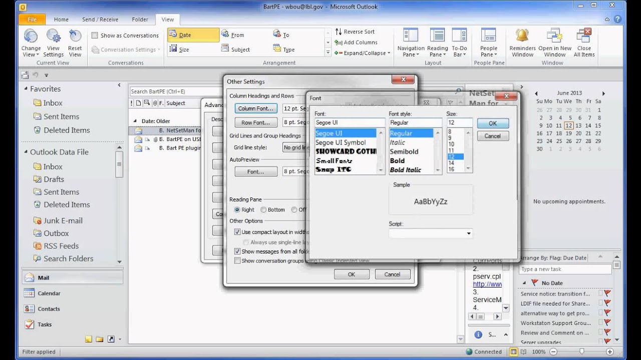
:max_bytes(150000):strip_icc()/tools_options-5c8c1b75c9e77c0001a9264c.jpg)
